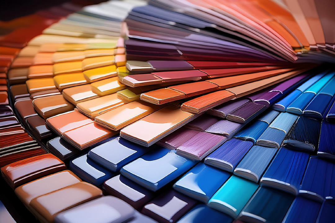
Understanding Color Psychology
We’re about to spill the beans on why color isn’t just for pretty rainbows. For us web wizards, colors are our secret weapons in tweaking how folks feel and act when they crash our online parties. Get the scoop on how colors can hit the spot and make our digital masterpieces a notch above the rest.
Impact of Colors on Behavior
Colors have a way of tickling our brains in funny ways. Ever notice how blue makes you feel all chill and trustworthy? That’s why banks use it to say, “Hey, we won’t lose your cash!” Red, on the other hand, screams urgency—perfect for that “Buy Now!” button you can’t resist clicking. Cultures see colors differently too, so being a savvy designer means knowing what vibes you’re putting out globally. Our job’s about making emotionally and culturally savvy designs that make brands stand out.
A bunch of Stanford folks found that 75% of us judge a business’s trustworthiness based on how snazzy their site is. Plus, 93% of us are suckers for good looks when picking a product. Obviously, colors and website design are a big deal in what folks think and do when they surf our sites.
The Role of Color Schemes
A chill vibe on a website ain’t just about picking random colors. We’re talking killer color combos that guide people’s eyeballs, make them feel at home, and whisper the brand’s vibe into their ears. A solid color scheme is a psychological playlist, nailing the right mix of basics, pops, and accents to make magic happen on site. The trick here is blending the right color flavors into a sweet symphony without overpowering the main act—the brand itself.
Peep our cheat sheet to see how colors can spin moods and actions:
| Color | Emotion/Behavior |
|---|---|
| Blue | Chill, Trust |
| Red | Hype, Action |
| Green | Growth, Nature |
| Yellow | Happy, Look at me! |
| Purple | Royal, Artsy |
Getting cozy with these color meanings means we can create killer designs that hit home. Curious for more on keeping your brand’s colors in tune? Dance on over to our take on branding in web design.
Importance of Color Contrast
Diving into web design, color contrast jumps out as a superstar. It’s the kind of thing that can really give user experience, readability, and interaction a big boost. Let’s chat about cranking up those visuals with some dazzling color contrast and side-stepping the mess of low contrast.
Boosting Readability and User Interaction
Imagine scrunching your eyes trying to read blah gray text on a blah gray background! Not fun, right? That’s why popping contrast between text and background is a game-changer. It lightens up readability, which naturally gets folks to hang around and click with your site more (Abmatic AI).
We oughta stick with the Web Content Accessibility Guidelines (WCAG) to keep readability high. These folks say the contrast ratio should be at least 4.5:1 for regular text and 3:1 for big ol’ text, which is a win for people with visual challenges (Cosmico Studios). It’s like opening your website door to everyone—no one feels left out in the sea of shades.
| Text Type | Minimum Contrast Ratio |
|---|---|
| Normal Text | 4.5:1 |
| Large Text | 3:1 |
Want more pointers on making a website everyone loves? We’ve got the scoop on website design best practices.
Stepping Away From Low Contrast Blunders
Low contrast is like asking visitors to your site to bail out early and never call back. It’s tough to read a site’s content with sneaky-low contrast; users get fed up and jump ship almost immediately (Abmatic AI). High bounce rates and going back to the drawing board—it’s no party.
To dodge this fiasco, take those designs for a spin on different gadgets and under various lights. Use handy-dandy tools that check color contrast, making sure your content pops.
Dialing up the contrast doesn’t just tick the readability box; it also crafts a space that everyone can enjoy, hit, and favor. That’s what good design’s all about—it’s colorful hospitality. For more goodies, peek at our tips on typography in website design.
By putting color contrast front and center, we’re building a web that’s parade ready—vivid, inviting, and crafted for everyone. It’s all about creating a visual feast while nodding to the fun art of color psychology in web design.
Cultural Influence on Color Perception
When it comes to color psychology in web design, things can get a bit wild, especially when we sprinkle in cultural nuances. Getting how colors hit different notes across cultures helps us whip up websites that truly vibe with folks all around the globe.
Cross-Cultural Color Interpretations
The way we see colors is often shaped by culture. Take a trip around the world, and suddenly, your favorite color might stand for something completely different. Like, who knew? Green’s the color of cash in the USA, but in China, it’s all about that red. This really shines a big, flashy spotlight on the need to understand these differences when designing for all kinds of people.
| Color | USA Interpretation | China Interpretation |
|---|---|---|
| Red | Excitement, Danger | Happiness, Prosperity |
| Green | Money, Nature | Health, Prosperity |
| Blue | Trust, Serenity | Immortality, Healing |
| Yellow | Happiness, Warning | Royalty, Honor |
Digging into these cultural vibes helps us steer clear of any major hiccups and forge connections that really hit the mark. Just think, you might use red to thrill Western audiences, but in China, it might just scream joy and wealth.
Customizing Designs for Global Audiences
Going global? Time to be a color chameleon! We’ve got to shape those palettes to reflect what colors mean around the world. Doing this seriously boosts how a site lands with its audience. Let’s dodge those cultural trip-ups and instead make some genuine bonds.
Here’s how we roll with customizing:
- Research Cultural Color Meanings: Dig into what colors mean where.
- Adapt Color Schemes: Pick colors that vibe with local folks.
- Test with Local Audiences: Get feedback from the locals.
- Be Mindful of Color Combinations: Mix with care so you don’t say the wrong thing.
Getting your color choices right can also keep your brand looking sharp. Want more on color and branding power? Hop over to our article on branding power of color.
By blending cultural insights into our design plans, we end up with sites that not only pop visually but also strike a chord with everyone visiting. For more on slick web design tricks, peep our guide on website design best practices.
Grasping how colors are understood across cultures and tweaking designs to fit helps us get through to a global audience. This makes user experiences richer and boosts a website’s oomph. For more on including these tips, check out our tidbits on web design layout principles and typography in website design.
Playing with Colors for Feelings
Ever thought about how colors make you feel? Well, they do a whole lot more than look pretty! They’re key in swaying our emotions and experiences online. By choosing warm or cool colors with care, we can stir up feelings and build a brand persona that our crowd really clicks with.
Warm and Cool Colors: The Battle of Hues
Warm colors like red, orange, and yellow aren’t just about sunshine and rainbows—they pack a punch with emotions like happiness, excitement, and pure energy. But watch out! They can also bring on danger and anger vibes. Cool colors like blue, green, and purple calm the nerves but can turn a bit chilly, bringing in feelings of sadness or even indifference. They speak of creativity, mystery, and high-end allure.
Let’s break it down:
| Mood Vibes | Colors | Emotional Rollercoaster |
|---|---|---|
| Warm Tones | Red, Orange, Yellow | Joy, Pep, Zing, Thrill, Alert |
| Cool Tones | Blue, Green, Purple | Chill, Blues, Artistry, Enigma, Class |
When dreaming up a website, think about how the crowd might react to these colors. A wild, fun-loving brand? Toss in those bold warm splashes. For something zen-like, a health vibe perhaps, cool hues are your calming friends. Wanna ace your website design game? Peek at our tips on website design best practices.
Shaping a Brand’s Identity with Color Magic
Colors aren’t just dressing; they’re the lifeblood of a brand’s look. Picking and sticking to the right colors sets us apart and makes folks remember us. People’s take on color can vary wildly, especially across cultures, so keep an eye on what fits the brand’s style and the audience.
Crafting a Standout Brand Image in Colors:
- Feel the Brand Vibe:
Zero in on what makes the brand tick—bouncy and lively or cool and professional? That choice gives you the color palette. - Do Your Color Homework:
Study how colors play out in different cultures to ensure our colors talk nice to everyone. Hit up cross-cultural color interpretations for the lowdown on color chat worldwide. - Stay Steady with Colors:
Use your colors everywhere—from websites to fancy flyers. It keeps people remembering you. Check out more on this in our piece on branding in web design. - Call in the Color Pros:
Chat with a color guru or seasoned designer to nail that killer color mix.
Mix these strategies to spin the color wheel of psychology in your favor, shaping what folks think about your brand and nailing that identity. For more on color theory, wander over to our guide on integrating color theory into web design.
Colors do more than please the eye—they roll up their sleeves and work on the user’s experience. Let’s take this color wisdom to craft stirring, unforgettable websites!
Practical Tips for Effective Color Selection
Picking out colors that pop for your site is super important for leaving a lasting impression on visitors. We’re about to spill the beans on some handy tips to nail the art of color mixing and keep things trendy without messing up our brand’s vibe.
Integrating Color Theory
Color theory is like the secret sauce for smart color choices in web design. By grasping how colors vibe together, we can craft eye-catching combos that make users stick around. Here’s the lowdown:
- Color Wheel: Think of it as the cheat sheet that shows how colors connect. We’ve got the big players: primary, secondary, and tertiary colors.
- Complementary Colors: Pop from opposite ends of the wheel, like blue and orange, giving off that dazzling high-contrast spunk.
- Analogous Colors: Best buds on the wheel, like blue, blue-green, and green. They whisper harmony and coziness.
- Triadic Colors: A trio evenly spread out, like red, yellow, and blue—they offer a lively and balanced effect.
| Concept | Description | Examples |
|---|---|---|
| Complementary Colors | Bold, eye-catching contrast | Blue & Orange |
| Analogous Colors | Easy-going and harmonious | Blue, Blue-Green, Green |
| Triadic Colors | Lively and symmetrical | Red, Yellow, Blue |
Knowing these basics lets us mix and match colors until we find our perfect combo. If you’re curious, check out color psychology in web design for more insights on using these tools to their fullest.
Balancing Trend and Brand Identity
Jumping on trend trains is all good for keeping our site snazzy, but we mustn’t lose our brand’s distinct vibe in the shuffle. Here’s how we keep it real:
- Stick To Brand Colors:
Use colors from our brand palette to keep things familiar. This helps in building brand recognition. - Know What The Audience Likes:
Peek into our audience’s color tastes. People see colors differently based on their backgrounds—like trust in blue for corporate sites, or how pastels might attract the younger crowd. - Play With Colors:
Test different color combos in a safe space. Running AB tests gives a peek into which colors really pull viewers in.Test Element Audience Response Preferred Scheme Primary Color: Blue Trusty and dependable Blue Primary Color: Red Bold and thrilling Mixed - Trendy Yet True:
Keep an eye on current popular styles, but choose wisely. Not every fad will jive with our brand’s soul. Pick trends that jazz up our design without derailing our brand identity.
By folding these strategies into our process, we can paint a picture with our colors that’s both true to our brand and exciting for our visitors. For more on leveling up your website’s look, dive into website design best practices and let the creativity flow.
Color Psychology in Web Design
Branding Power of Color
Alright, folks, let’s talk about the magic of colors in web design. They’ve got superpowers when it comes to setting the vibe of your brand. You know those giants like Coca-Cola, Ford, and McDonald’s? They didn’t just randomly pick their colors out of a hat. They knew that colors could mess with how we feel and think. This whole “color psychology” thing isn’t just artsy-fartsy stuff—it’s about how different hues flash emotions and messages.
Think about it:
- Blue: It’s like your reliable friend—trusty and calm.
- Red: Picture a hyped-up cheerleader, full of pep and energy.
- Yellow: Sunshine in a crayon—happy and bright.
- Green: Nature’s fan club—fresh and healthy vibes.
Picking the right colors is like pairing wine with cheese—it can elevate the whole experience. Getting those text and background contrast right? That’s the secret sauce for readability and hooking folks on your site.
Consistent Application for Brand Recognition
Color needs to stick around, like that catchy song you can’t get outta your head. Keep it consistent across all your digital stuff, and boom, you’ve got brand recognition working for you. People actually remember colors better than names—cool, right? Coca-Cola’s bold red or McDonald’s golden arches—they’re timeless because they nailed this.
To keep everything on point, whip up a design guide. Jot down the color codes and where they need to show up online. This way, your brand stays sharp and easy on the eyes.
| Brand | Signature Color | Emotion Perceived |
|---|---|---|
| Coca-Cola | Red | Pumped and lively |
| Ford | Blue | Steady and dependable |
| McDonald’s | Yellow | Smiles and sunshine |
Need more tea on web design? Check out our guides on branding in web design, website best practices, and typography in web design. These will help you get those colors talking in harmony with your grand design scheme, making your site a joy to visit. Keep those colors consistent to unleash the full mojo of color psychology in web design and nail that brand mojo just right.
Here some recommended links selected for you: The Best Books of the Month, Todays best Deals at Amazon, Best Sellers in Cell Phones & Accessories and last but not least the easy and great way to send a gift for the holidays: Amazon.com eGift Card (Instant Email or Text Delivery).